提示词
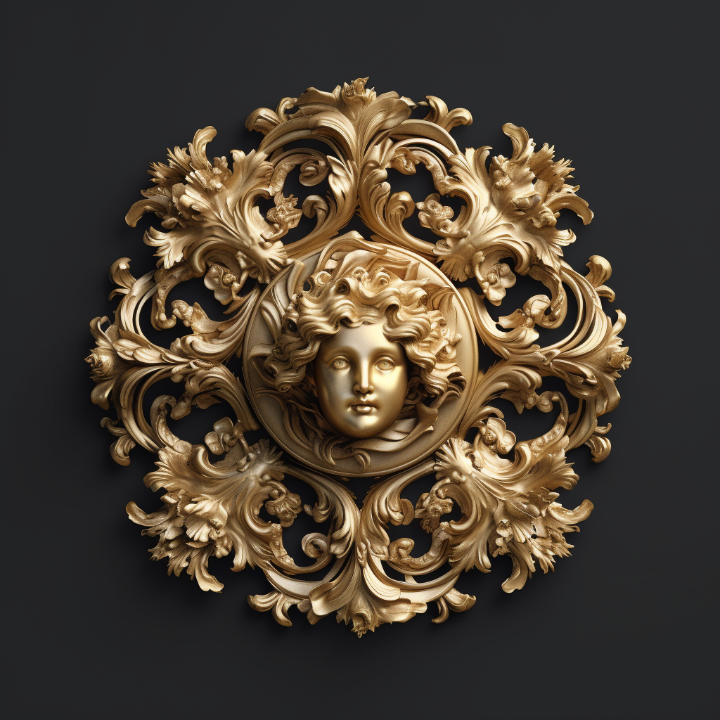
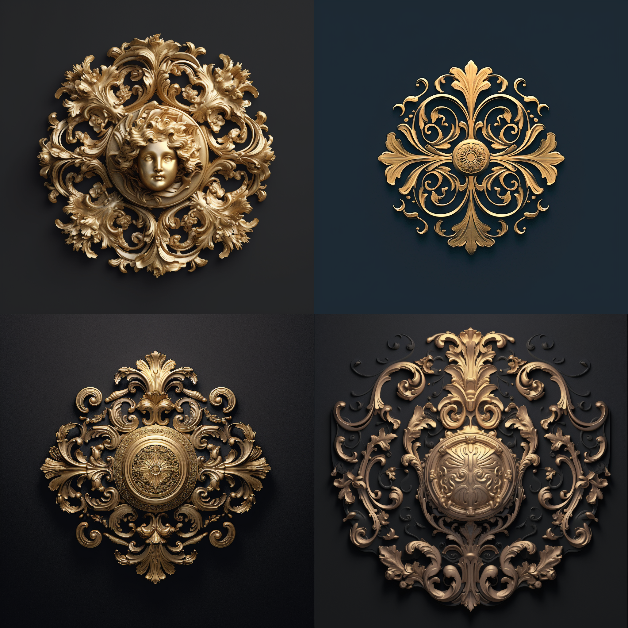
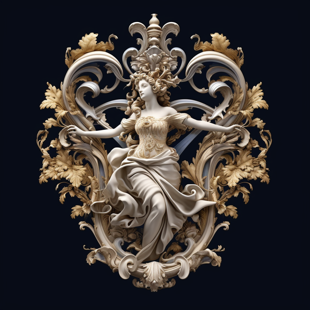
The logo features a central motif inspired by the dynamic and expressive qualities of Baroque art. It incorporates curvaceous and fluid forms that evoke the sense of movement and energy found in Baroque sculptures and architecture. Surrounding the central motif, there are ornate flourishes and intricate details reminiscent of the lavish and ornamental elements often seen in Baroque artworks. These elements add a sense of opulence and grandeur to the logo design. To establish a connection with the historical context of Baroque art, the logo may subtly reference renowned Baroque masterpieces. For instance, incorporating elements inspired by Gian Lorenzo Bernini’s “Apollo and Daphne” or Peter Paul Rubens’ “The Descent from the Cross” can enhance the logo’s authenticity. Color Palette: For the color palette, consider using rich and luxurious colors commonly associated with Baroque art. Here’s a suggested combination: Deep burgundy: Conveying elegance, sophistication, and richness. Gold: Symbolizing opulence, prestige, and grandeur. Ivory or off-white: Adding a touch of purity and balance to the overall design. Typography: Choose a typeface that strikes a balance between ornate details and legibility. Consider a classic serif font with intricate letterforms or decorative elements that reflect the opulent nature of Baroque art. Ensure that the typography remains clear and readable, even at smaller sizes.












暂无评论内容